Mental wellness · Mobile app
Rose Garden
Designing a journaling and self-reflection app for UCLA students that makes emotional check-ins feel softer, more rewarding, and more intentional through the rose, bud, and thorn framework.
Designing a journaling and self-reflection app for UCLA students that makes emotional check-ins feel softer, more rewarding, and more intentional through the rose, bud, and thorn framework.
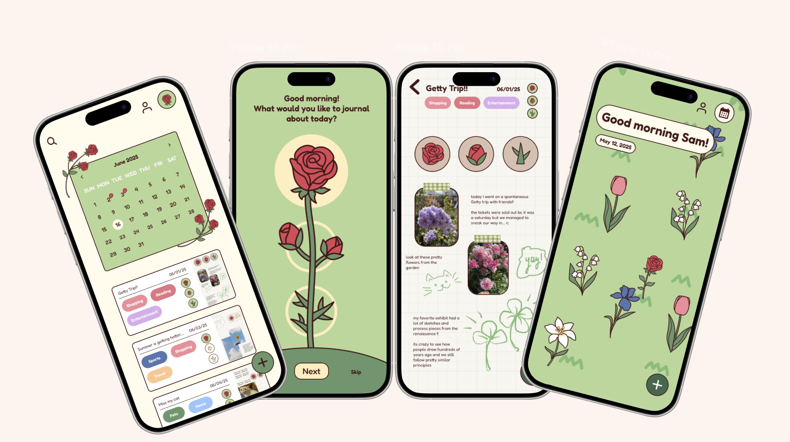
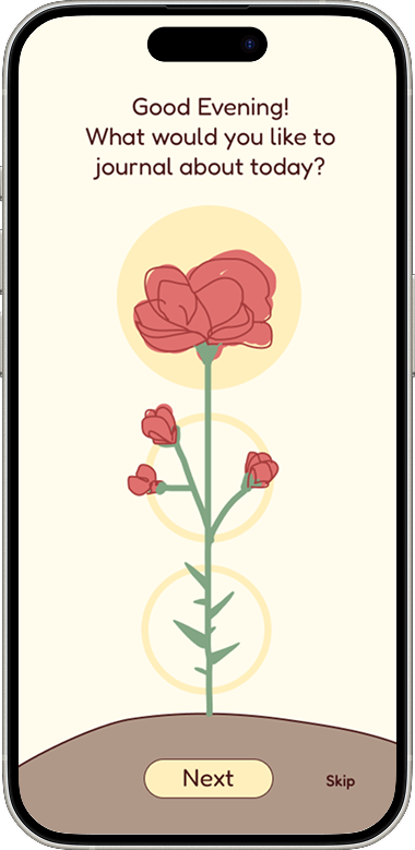
Rose Garden is a mental wellness journaling app designed for UCLA students. The experience was built around the rose, bud, and thorn reflection framework, encouraging users to log something positive from their day, something they are looking forward to, and something challenging they are navigating.
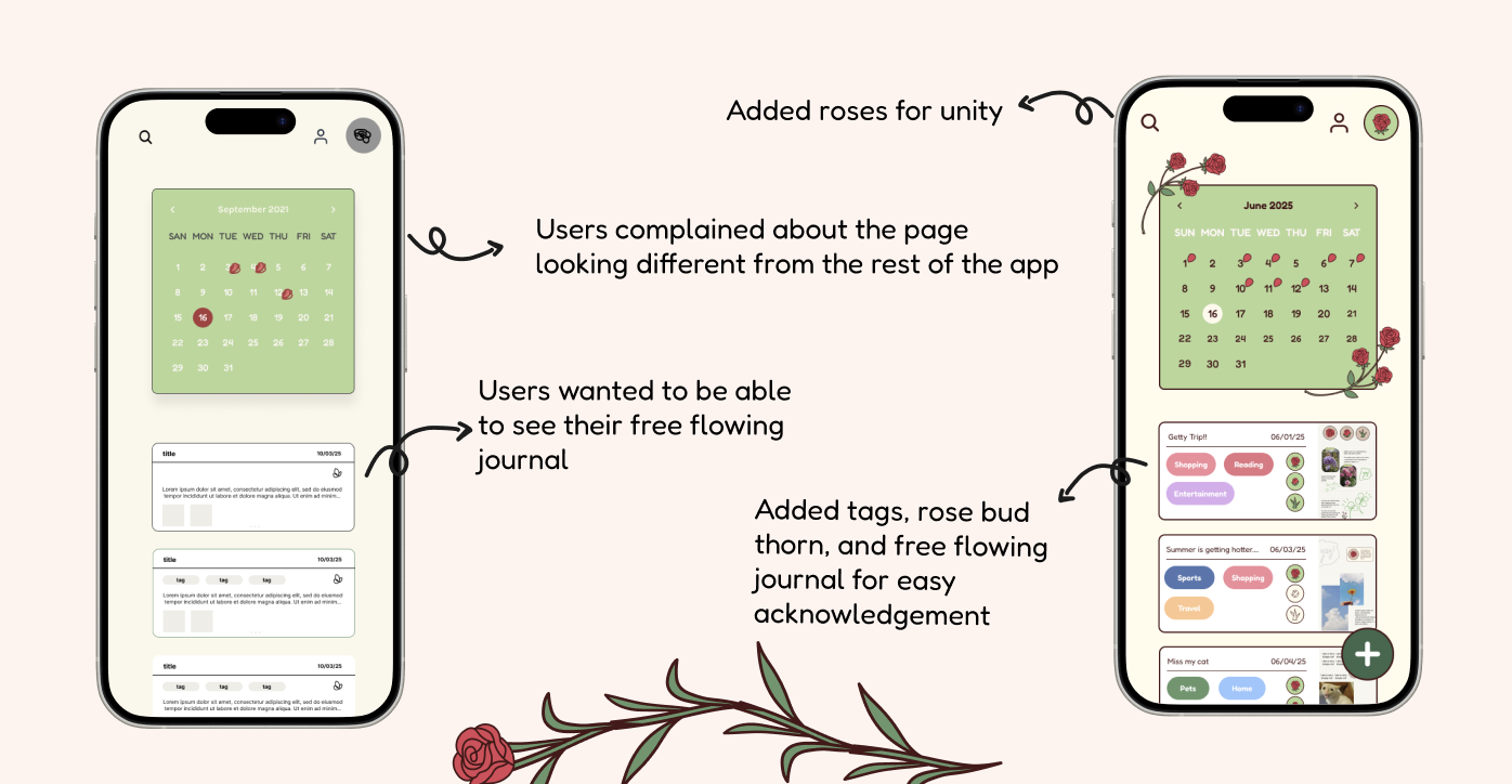
Rather than making journaling feel like another task, we wanted the experience to feel gentle, visually comforting, and rewarding. To support that, the app also included free-flow journaling, flower planting, a calendar view, and profile customization so reflection could feel more personal and growth-centered.
Our concept was grounded in the idea that reflection should not feel clinical or difficult to begin. We were inspired by how gratitude and structured reflection can help users process their day in a lighter, more meaningful way.
The vision for Rose Garden was to make journaling feel like a small act of care. By tying emotional check-ins to flowers, growth, and customization, the experience turns self-reflection into something students can actually look forward to.
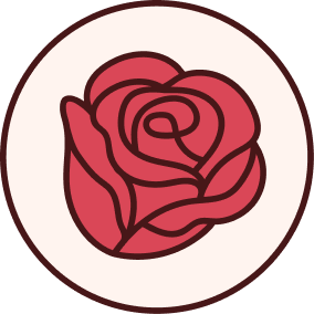 Something good
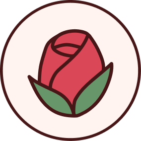 Something to look forward to
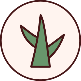 What was a challenge
Early interviews helped us understand what students were looking for in a journaling or mental wellness app. A recurring theme was that users wanted a tool that helped them reflect without requiring too much effort or emotional energy to get started.
We began by mapping the overall structure of the experience through low-fidelity wireframes. At this stage, the focus was on understanding the flow between journaling, reflection, planting, and profile-based motivation rather than visual polish.
These explorations helped us figure out how guided reflection and free journaling could exist in the same product without the experience feeling cluttered.
As the product evolved, we refined the app to better balance guidance with flexibility. A major design challenge was making sure the app still felt structured enough to support reflection, while giving users room to express themselves more freely.
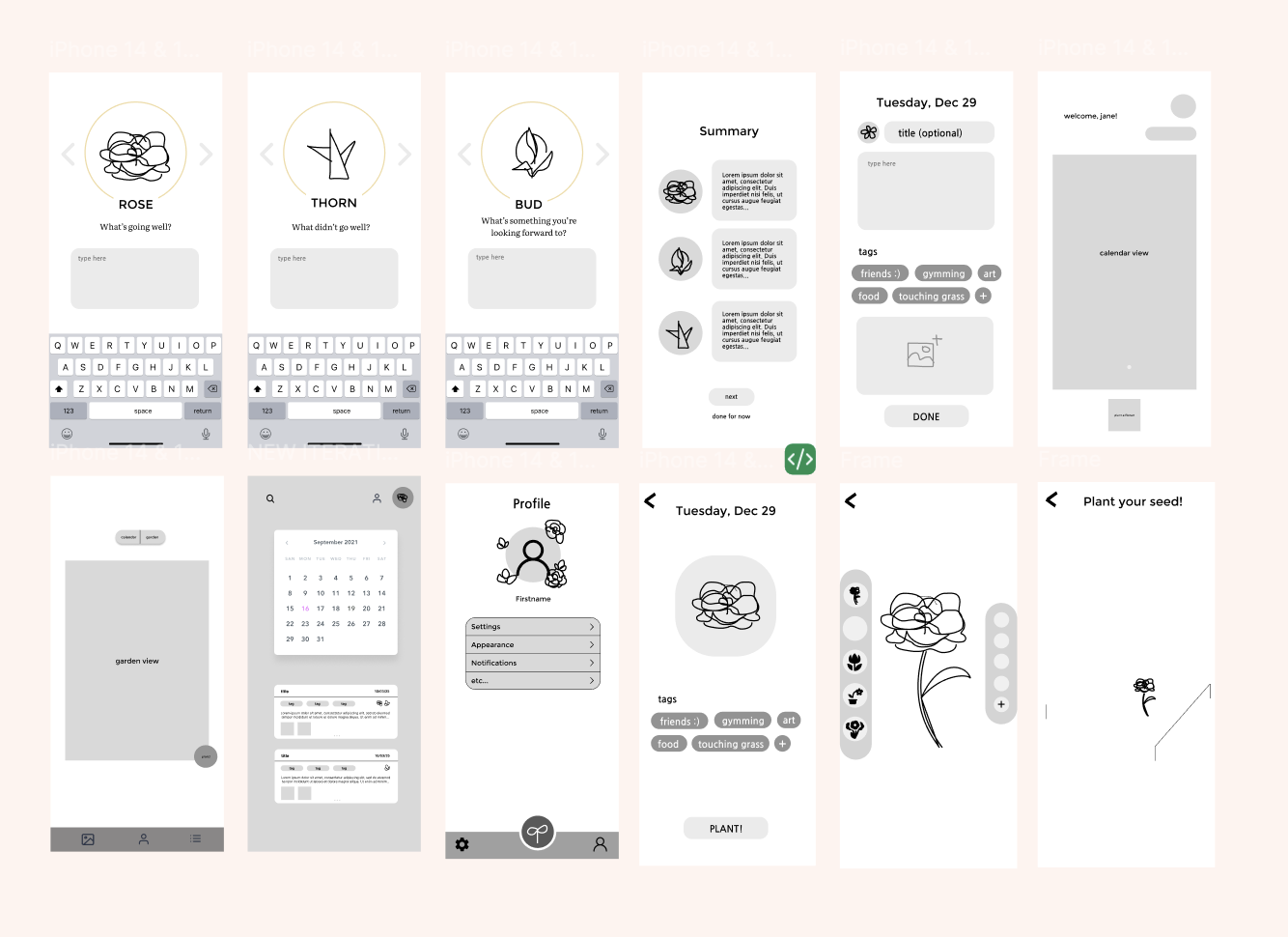
We revised the journaling flow so users could go back to the main page and continue moving through the rose, bud, and thorn system more naturally. This made the guided reflection feel more intuitive and less rigid.
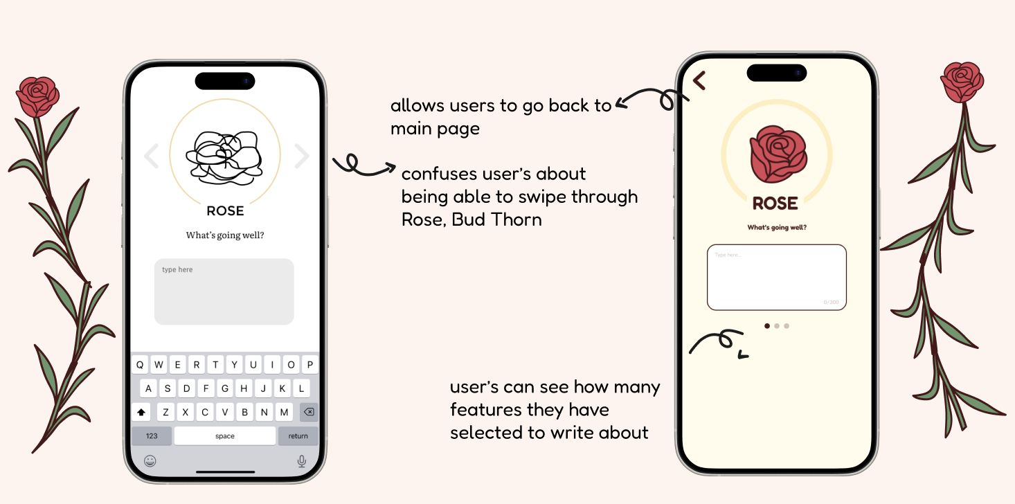
We adjusted the calendar page to feel more visually unified with the rest of the app and made it easier for users to revisit previous journal entries without losing the calming feel of the product.
The final product combined guided emotional reflection with more open-ended journaling and visual reward. The result was a mental wellness experience that felt more personal, softer to use, and more engaging over time.
We compared the original direction with a refreshed approach and decided to lean into more vibrant colors— richer pinks, clearer greens, and warmer accents—so the app felt more alive and inviting without losing its calm, floral feel.
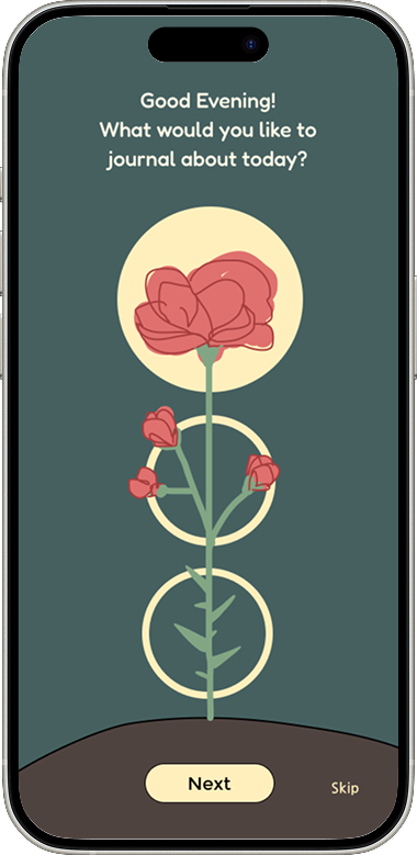
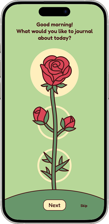
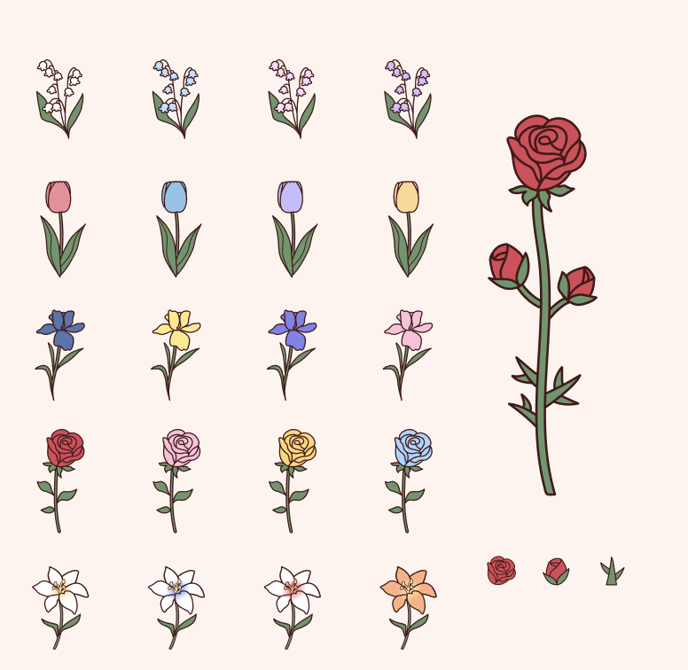
The visual direction for Rose Garden was intentionally soft, floral, and comforting. We used warm pinks, muted greens, cream tones, and illustrated flower elements to make the app feel emotionally safe and inviting.
Rather than relying on a heavily clinical mental health aesthetic, we wanted the experience to feel delicate, personal, and rewarding to return to.
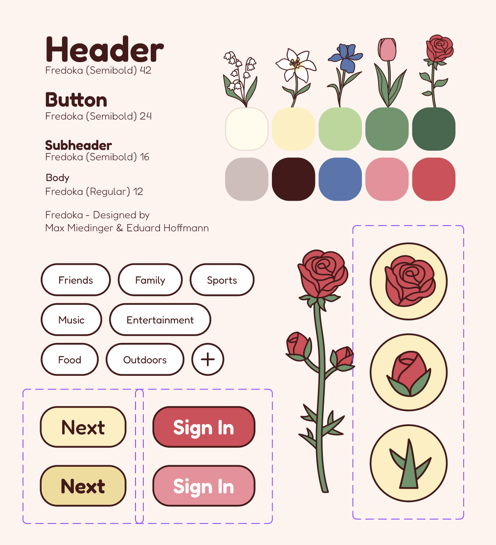
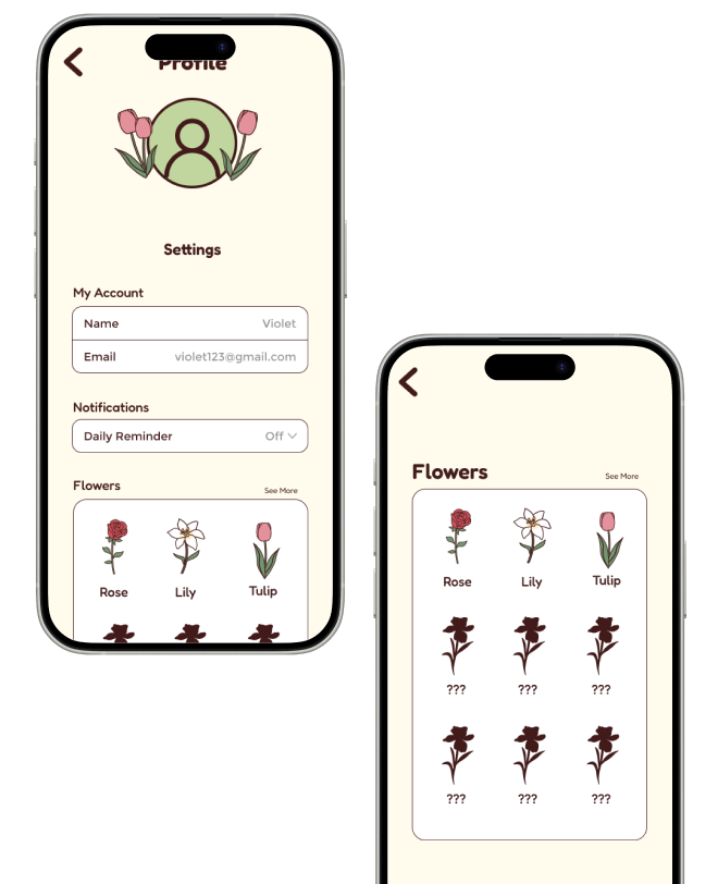
A big part of the project’s personality came from the custom flower illustrations. These visuals helped carry the metaphor of emotional growth throughout the entire app and made the product feel distinct from more standard journaling experiences.
A few other projects that show how I design across community engagement, decision support, and product thinking.
Designed a volunteer discovery and admin management experience that helps nonprofits organize events more clearly.
Built a product that helps users compare choices with weighted scoring, clearer reasoning, and a more confident final decision.
Learn more about who I am and what brought me into Product Management!