Community engagement · Mobile + admin
United Way
Designing a mobile and admin platform that helps volunteers discover local events while giving nonprofits better tools to organize, manage, and grow community engagement.
Designing a mobile and admin platform that helps volunteers discover local events while giving nonprofits better tools to organize, manage, and grow community engagement.
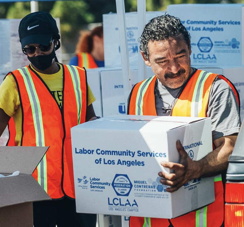
United Way of Greater Los Angeles is a nonprofit focused on strengthening local communities through direct services, partnerships, and advocacy. In collaboration with LA Blueprint, our team designed a digital platform to make volunteer opportunities more accessible, easier to manage, and more engaging for both participants and organizers.
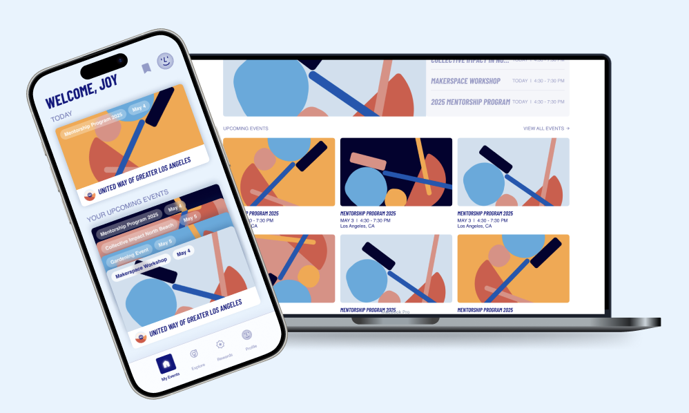
We approached this challenge by designing two connected experiences: a mobile app for volunteers and an admin dashboard for nonprofit organizers. Together, these platforms support event discovery, registration, engagement, rewards, and ongoing community participation.
The final product was designed as two connected experiences: a mobile platform for volunteers and an admin dashboard for nonprofit organizers. Together, they support discovery, participation, and event management in a clearer and more engaging way.
Through early research, critique, and synthesis, we uncovered a recurring tension: users needed quick access to upcoming commitments while also wanting the flexibility to explore new opportunities without overwhelming overlap.
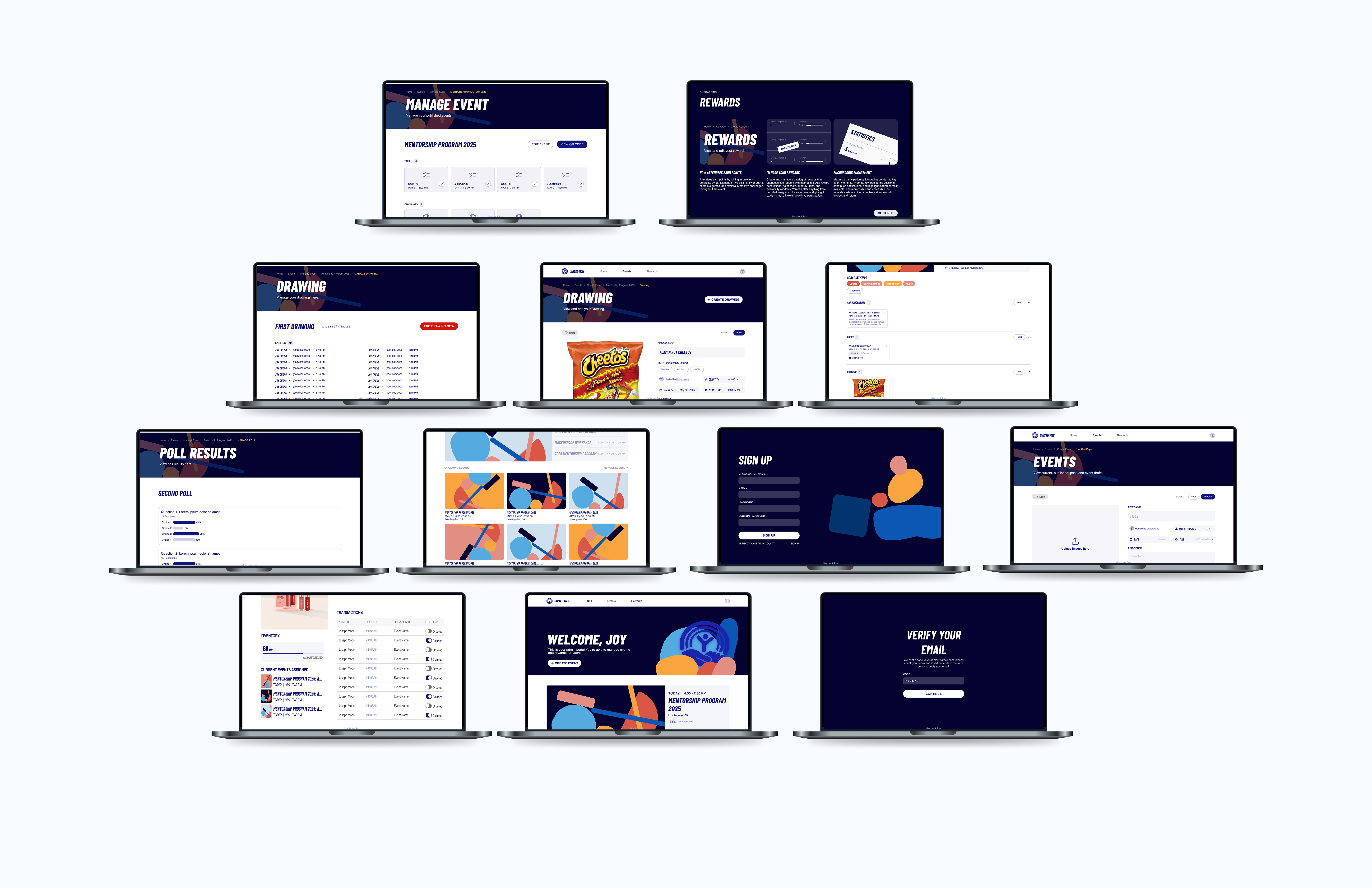
On the organizer side, admin users required more than simple event creation. They needed tools to monitor sign-ups, oversee raffle and poll activity, manage draft content, and coordinate operational workflows in a single streamlined interface.
With our mission to create an intuitive and empathetic mobile-based platform that empowers organizations hosting community events, we conducted a competitive analysis of six platforms offering event-hosting systems and rewards-based services related to our goals: EventPin, Luma, Ulta Beauty, Eventbrite, Nextdoor, and Fetch.
This audit helped us build a broader understanding of the current landscape and identify which patterns felt most user-friendly. It also guided us in improving editing workflows and steering away from interaction patterns that could create friction or reduce clarity.

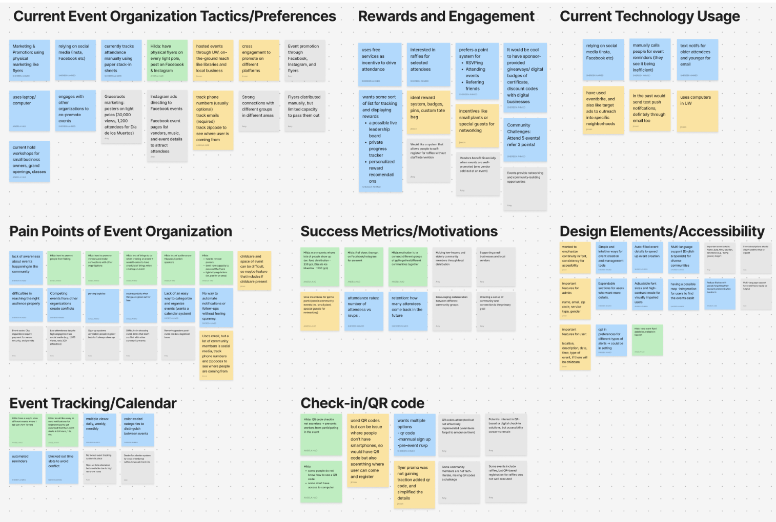
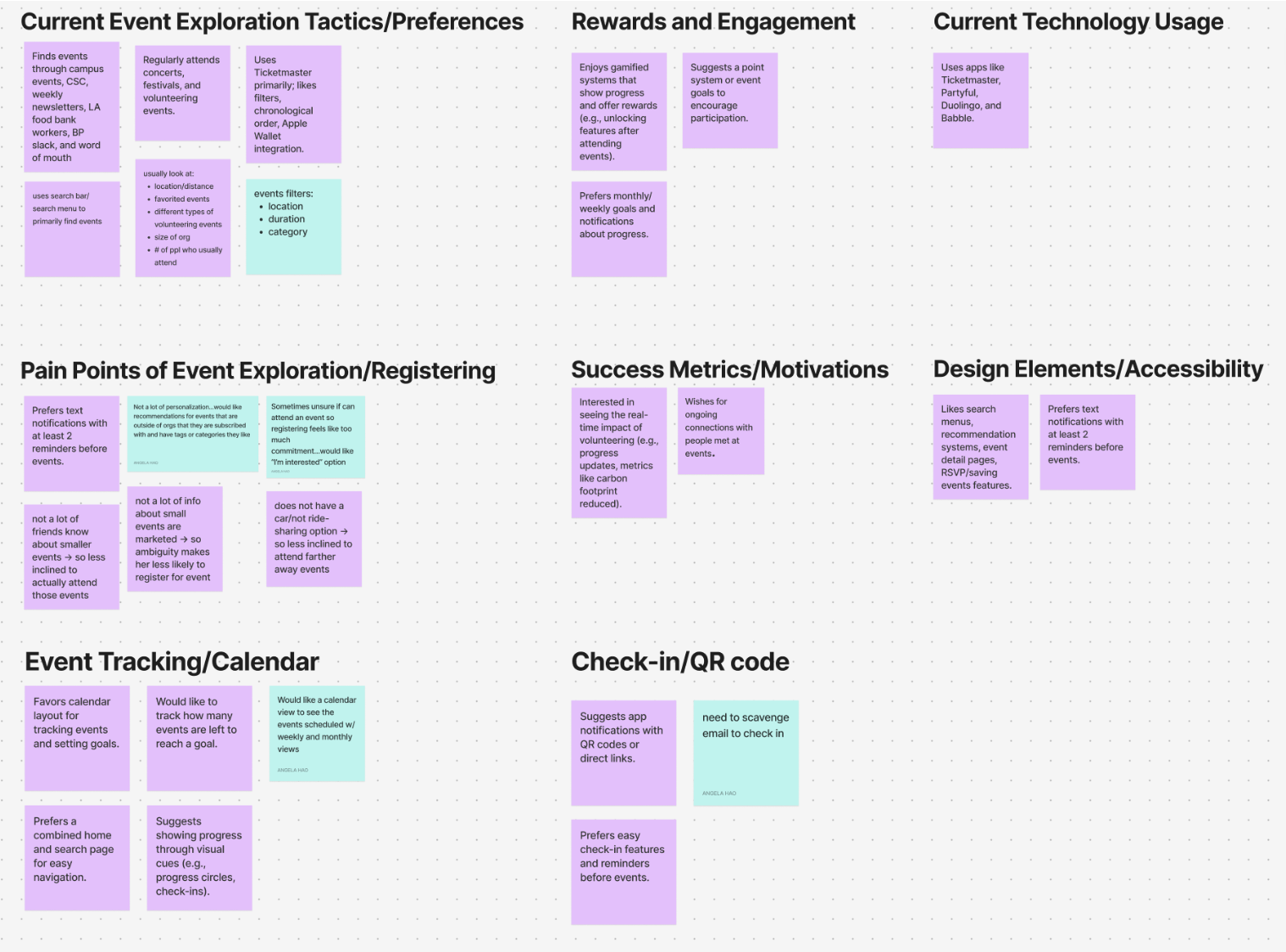
Following our interviews and competitive analysis, we synthesized our observations through an affinity map. This helped us identify recurring themes, shared pain points, and patterns across both volunteer and organizer needs.
Affinity mapping gave us a clearer way to organize the research into actionable directions, helping us distinguish what users valued most, where confusion emerged, and which product opportunities were worth prioritizing in the next design phase.
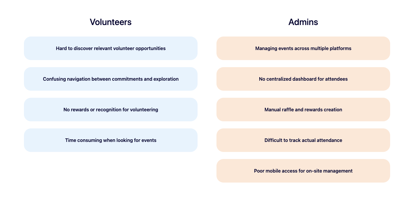
To better understand both sides of the product, we interviewed volunteers and nonprofit organizers. We wanted to learn how people currently discover opportunities, what motivates participation, and where friction shows up across sign-up, engagement, and follow-through.
These conversations revealed that volunteers cared deeply about clarity and convenience, while organizers needed operational support beyond simply publishing an event.
Users wanted a faster way to understand which events were relevant to them without digging through too many layers. They also needed clearer separation between the events they had already committed to and the ones they were still exploring.
Admin users needed visibility into sign-ups, guest management, drafts, raffles, polls, and event oversight in one place. The platform had to support real operational workflows, not just event creation.
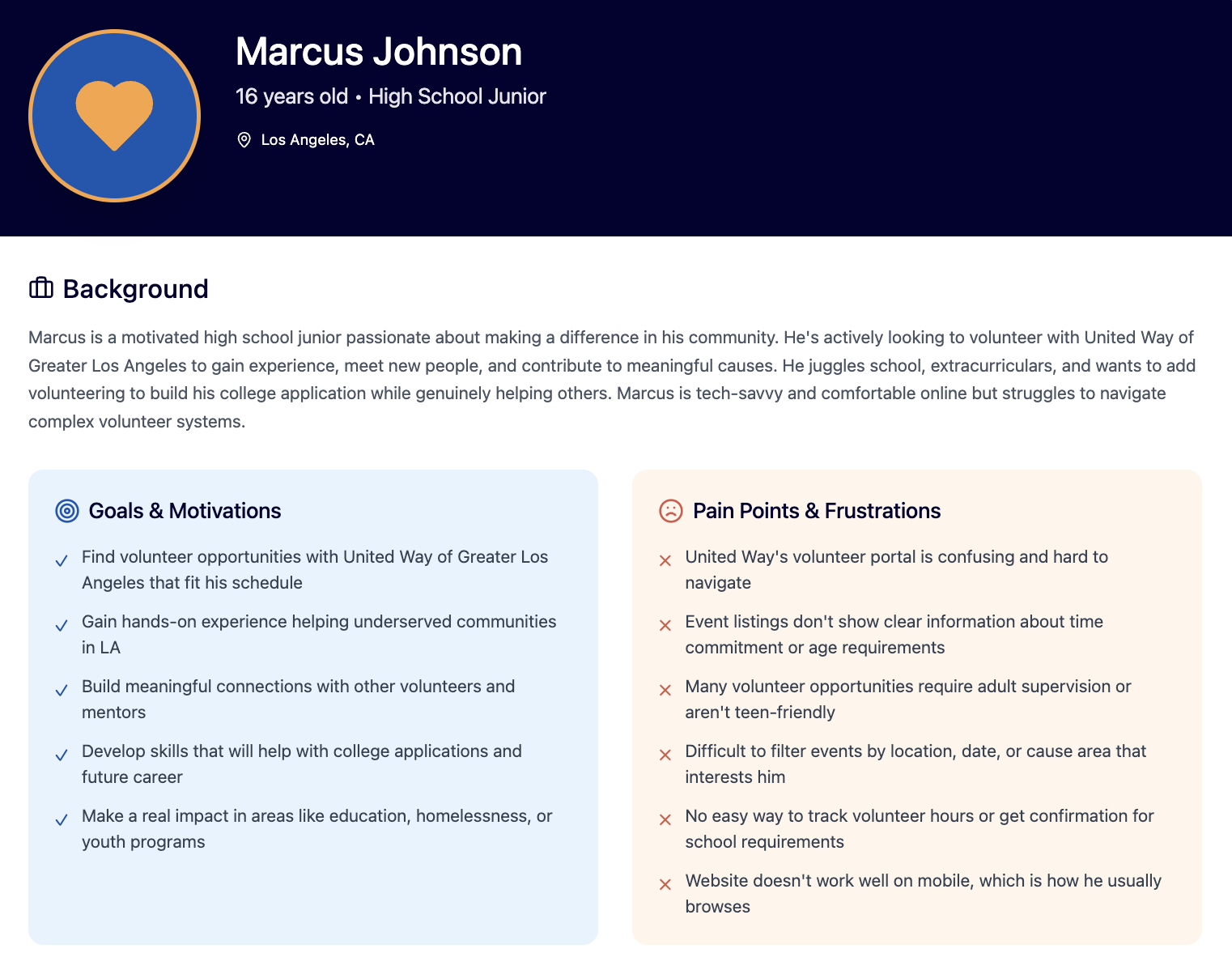
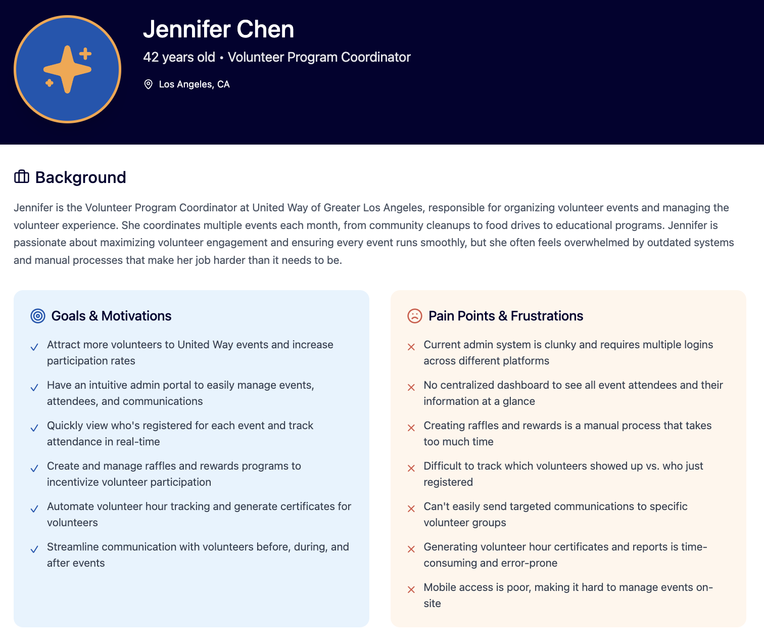
We created personas to reflect the different motivations, goals, and frustrations across the platform. These helped us design for distinct groups of users rather than treating the experience as one-size-fits-all.
These personas helped us understand how students discover opportunities, what motivates them to show up, and where friction appears between browsing, committing, and participating.
These personas represented the nonprofit side of the experience and helped us design around real operational needs like event setup, engagement tools, tracking participation, and managing rewards.
Our research surfaced friction on both sides of the system.
Our goal was to create a platform that makes discovering and participating in volunteer opportunities feel clear, motivating, and manageable for students, while also giving nonprofit organizers a more organized backend for creating events, tracking activity, and sustaining engagement.
In short, we wanted to design a system that better connected community members with the organizations serving them.
Based on the research, we explored features that could reduce friction for volunteers while giving organizers stronger control over event workflows. Early feature exploration focused on discovery, registration, filtering, rewards, and admin management tools.
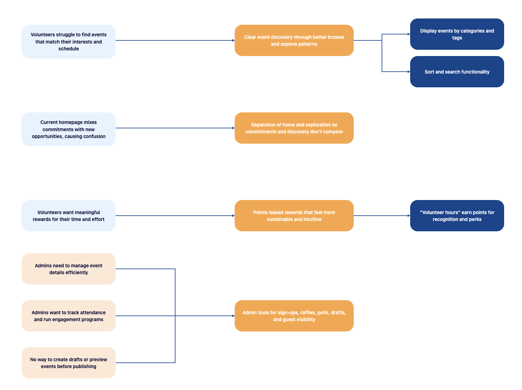
Once the feature directions became clearer, we mapped how the volunteer experience should be structured. The information architecture helped us define what belonged on Home, what should live in Explore, and how key flows could be grouped without unnecessary overlap.
This step became especially important because one of our biggest design challenges was making sure the product felt organized rather than repetitive.
For the admin side, we structured the IA around event management, guest and engagement tools (raffles, polls), and operational workflows so organizers could find everything without deep nesting.
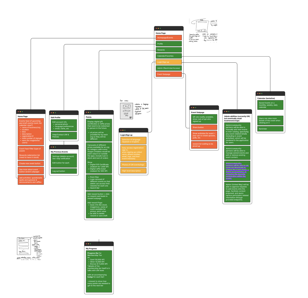
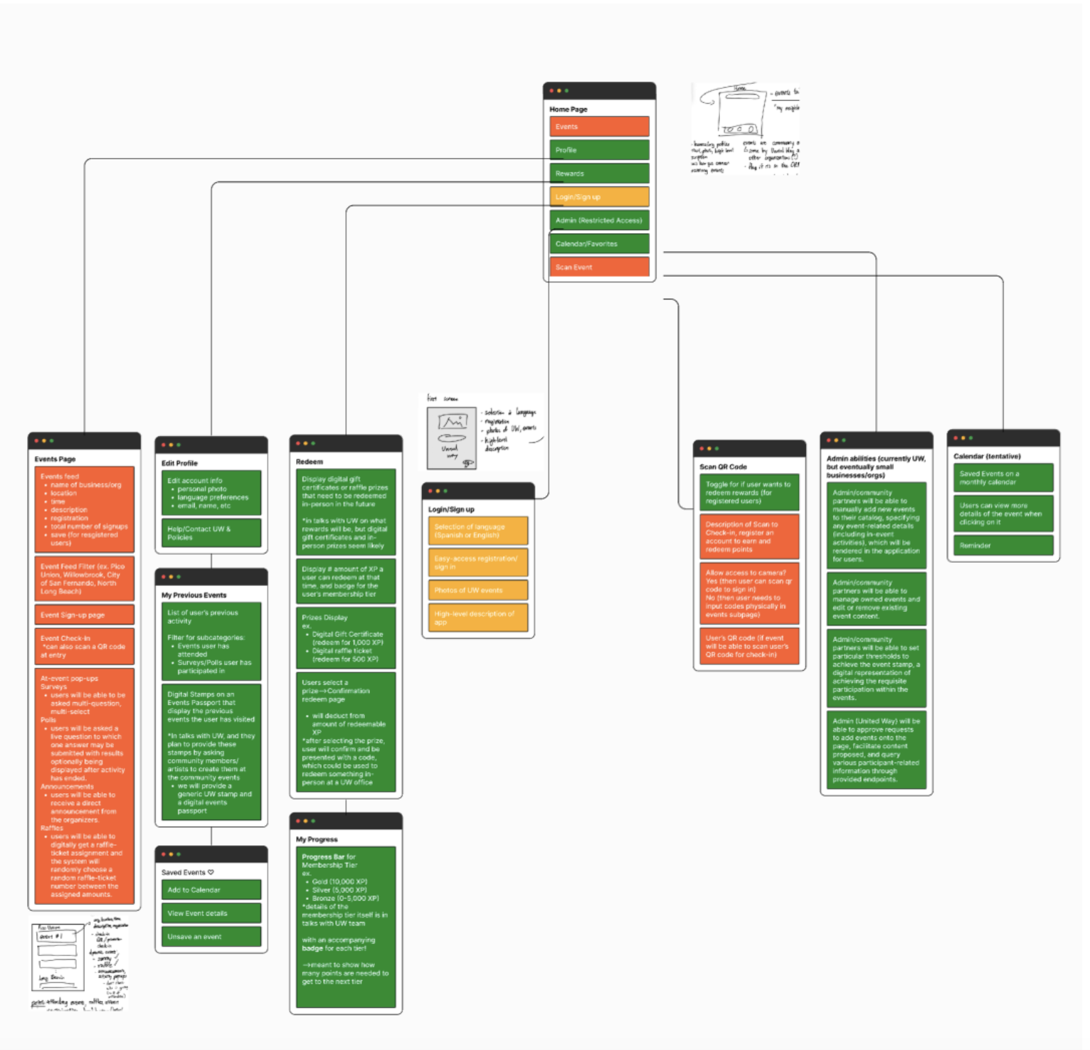
After synthesizing the research, we explored early wireframes to test how the product could work across both the volunteer experience and the organizer dashboard. At this stage the focus was on structure, navigation, and feature grouping rather than visual polish.
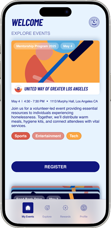
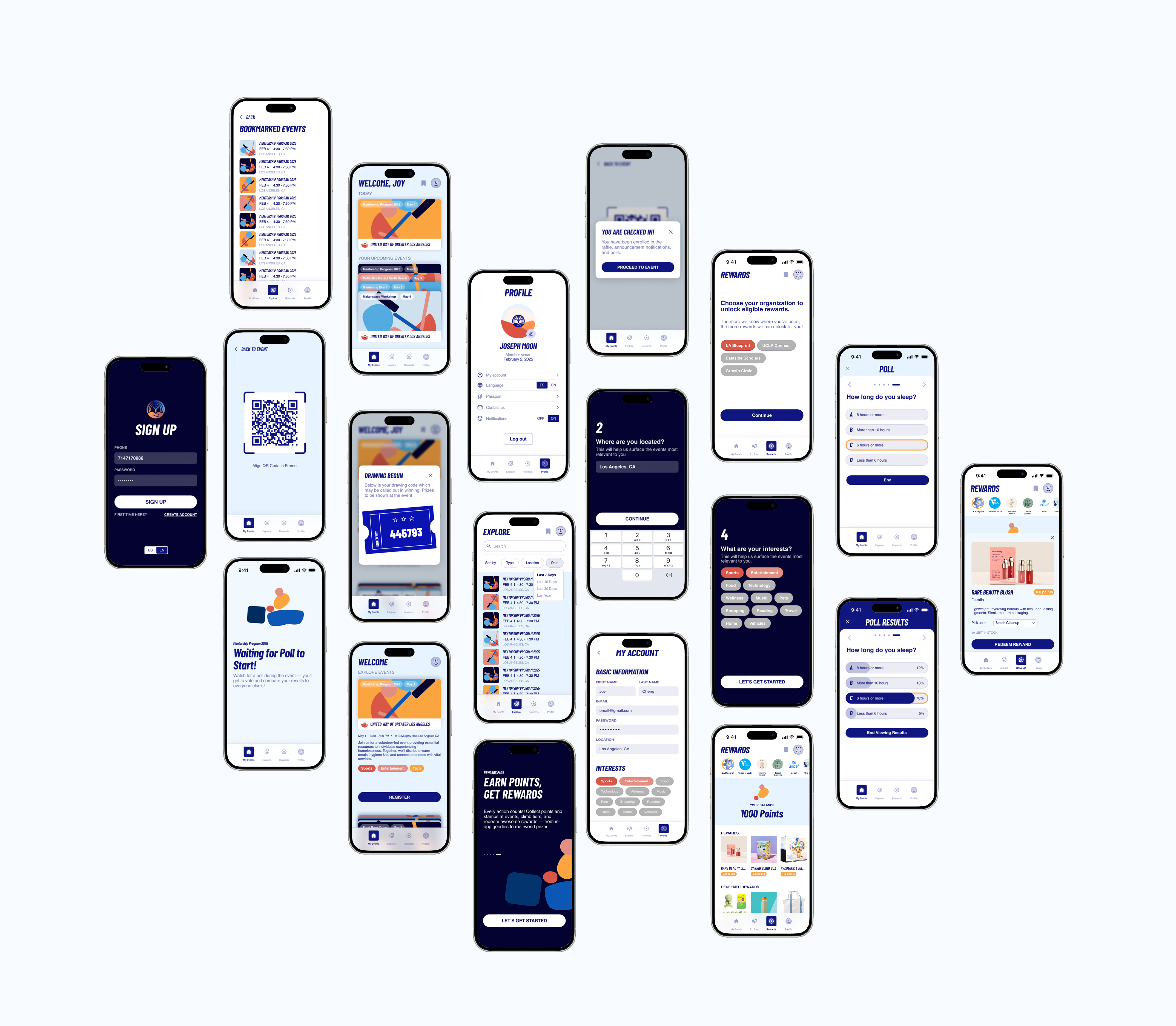
Early mobile wireframes explored how volunteers would browse opportunities, view upcoming commitments, and interact with rewards and engagement features. The goal was to keep the experience simple while surfacing the most important actions quickly.
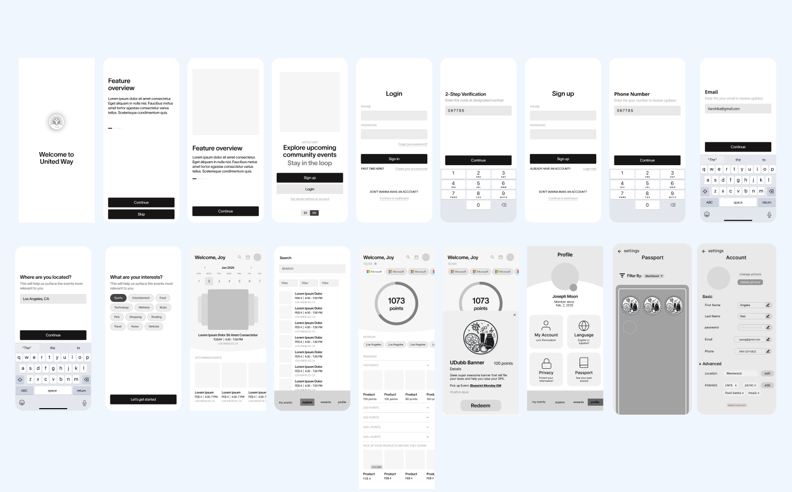
On the organizer side we explored layouts for managing events, tracking sign-ups, and overseeing engagement tools like polls and raffles during volunteer activities. These wireframes helped define how organizers would manage event operations.
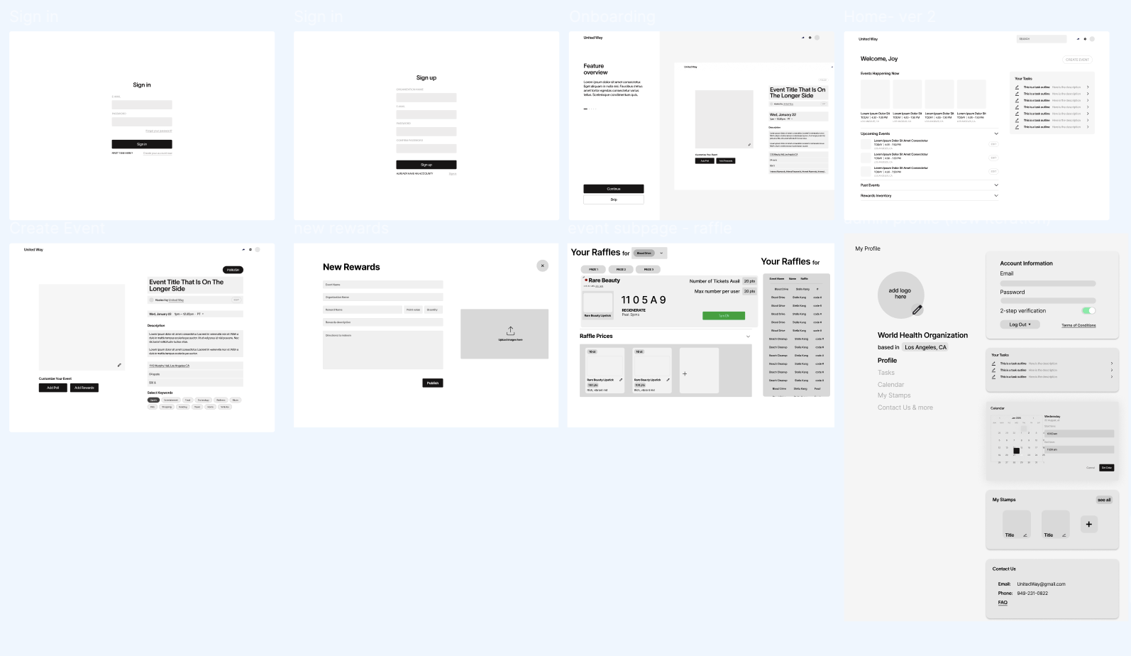
In mid-fidelity, we focused on reducing overlap, clarifying hierarchy, and making navigation feel more intentional across both the volunteer and admin experiences.
We asked 5 users to test the prototype and observed how they navigated the homepage and moved into the rest of the experience. Two participants struggled with the original homepage structure, which interrupted their ability to continue exploring naturally.
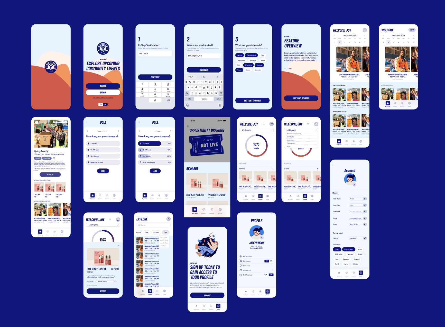
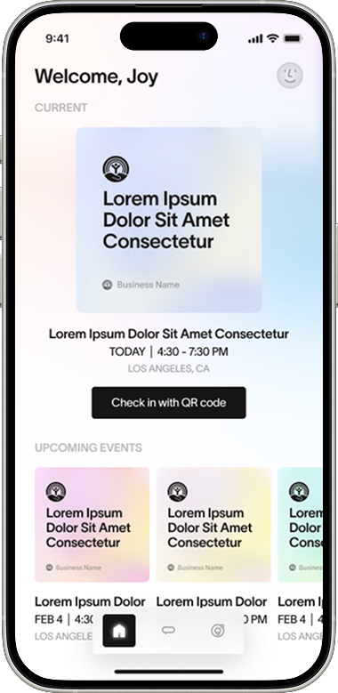
Based on this feedback, we redesigned the homepage to be cleaner and more informative. We introduced category blocks, surfaced more content on one page, and reduced repeated information so users could scan and explore more easily.

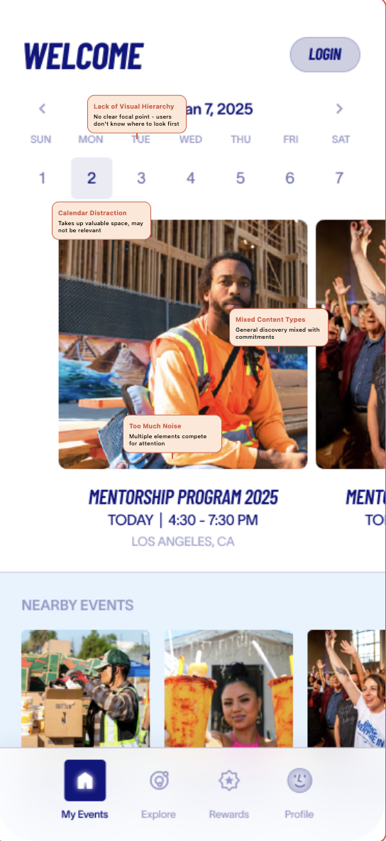
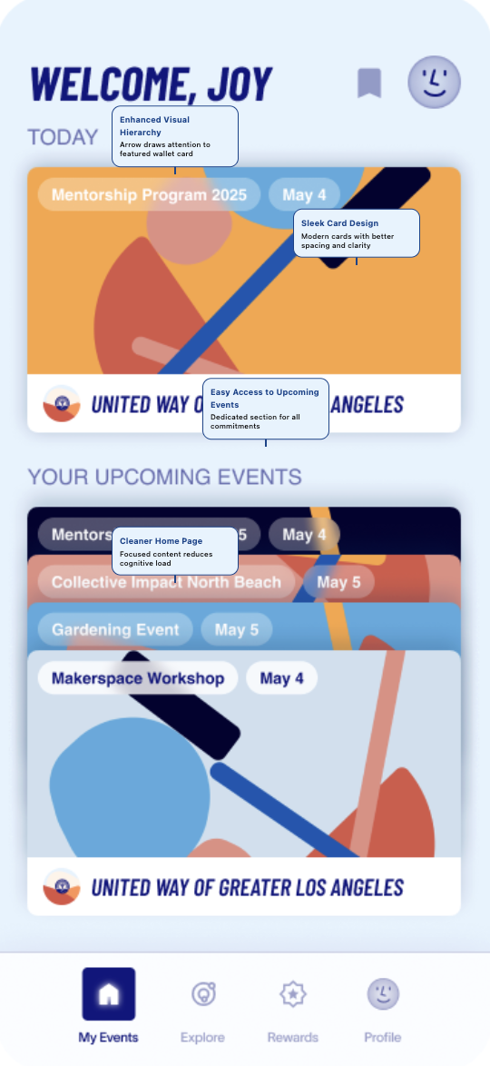
It was difficult seeing more than one event in a seamless way that allowed the user to quickly access an event. We drew inspiration from Apple Wallet so users could move through their saved events in a cleaner, more fluid way.
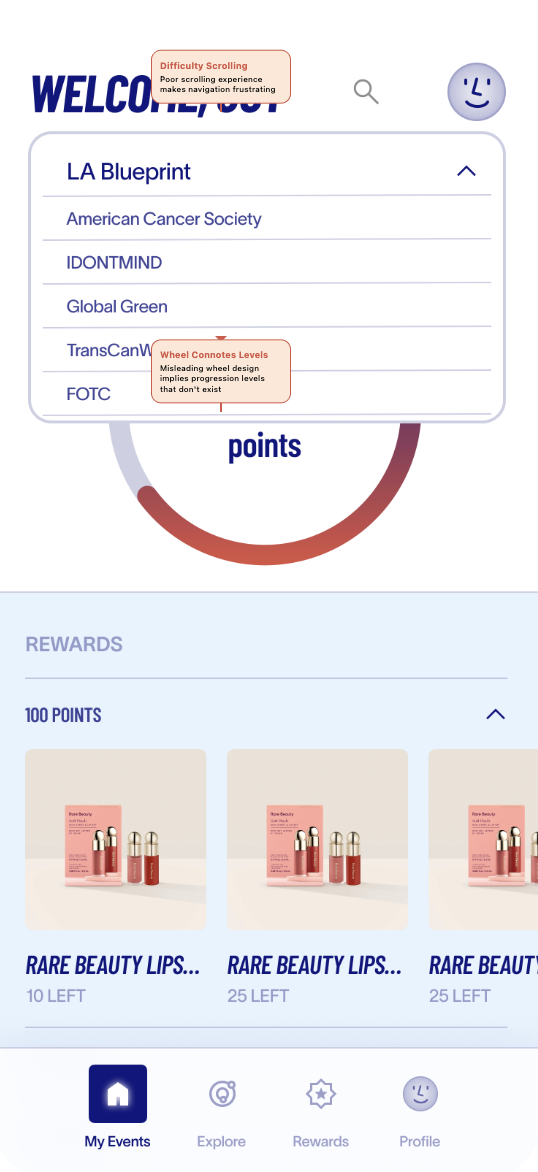
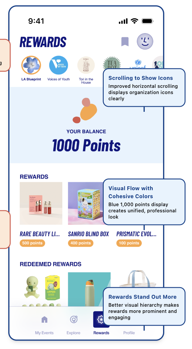
In the rewards section, users had a harder time browsing organizations when everything lived inside a dropdown. We replaced it with a horizontal scroll pattern using organization profile images so the experience felt faster and more visual.
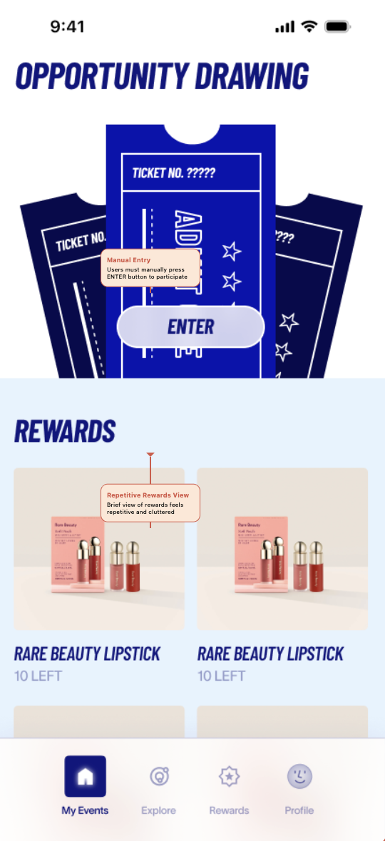
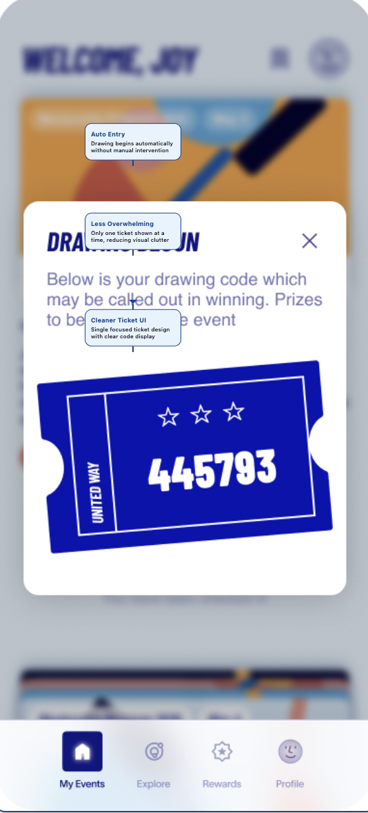
Originally, users had to manually enter the raffle after check-in. Testing showed this extra step felt confusing because most people assumed check-in was enough. We simplified the flow so check-in automatically entered them into the drawing, and we changed the language from raffle to drawing.
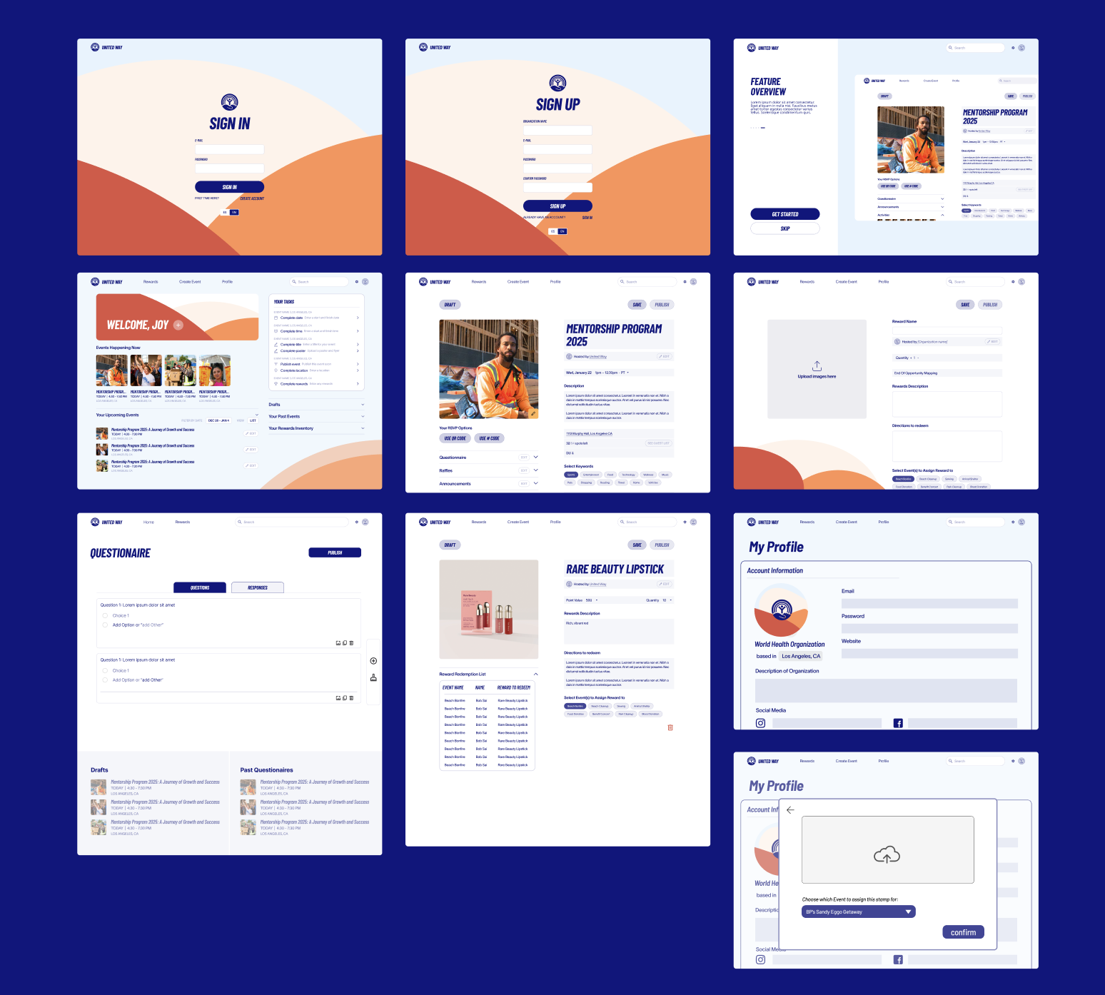
In our initial design, we assumed that point values and event context were most important to admins—so we organized rewards by event and emphasized points in the hierarchy, with a running list of users who had picked up each reward. Through testing, we realized that rewards are not tied to a single event; they can be shared across multiple events, which made the event-based grouping confusing and cluttered. Admins were more interested in tracking individual rewards, monitoring inventory, and quickly seeing how many items were claimed or still available, so we shifted the structure to focus on rewards themselves rather than any single event.
We compared earlier directions with the refined visual system. The final direction (right) emphasizes clearer hierarchy, stronger CTAs, and a more cohesive feel across the volunteer and admin experiences.
We applied the same old vs new comparison to the admin desktop experience so the chosen direction felt consistent across mobile and computer screens.
After validating the product direction through testing, we refined the visual system to make the experience feel clearer, more cohesive, and easier to scan. We used color to create hierarchy across event cards, rewards, and admin actions, while keeping typography bold enough to support quick recognition.
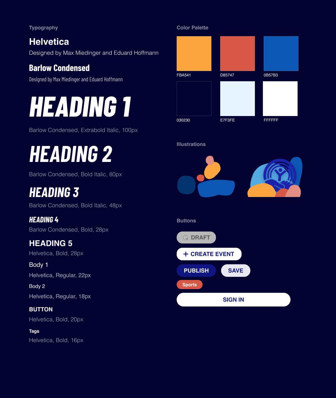
The final volunteer-facing experience emphasized upcoming events, exploration, check-in, rewards, and continued participation. We focused on making the app feel more scannable, motivational, and easy to navigate.
The admin experience evolved into a more operational tool for nonprofit organizers managing event logistics, participation, drafts, engagement tools, and reporting. We focused on making workflows easier to oversee without burying important actions too deeply in the interface.
This project ended up meaning so much more to me than just design.
At one point, our team went through a major shift in management, and it felt like everything we had built needed to be rethought from the ground up. We essentially had to compress nearly eight months of work into just one. It was overwhelming at first, but it pushed me in ways I didn’t expect. I found myself in the lounge every day, often for five hours at a time, carefully reworking layouts, rethinking flows, and trying to piece together how everything should function in a way that truly made sense.
Those long days were exhausting, but they were also where I grew the most — not just as a designer, but as someone who learned how to adapt, take ownership, and keep moving forward even when things felt uncertain.
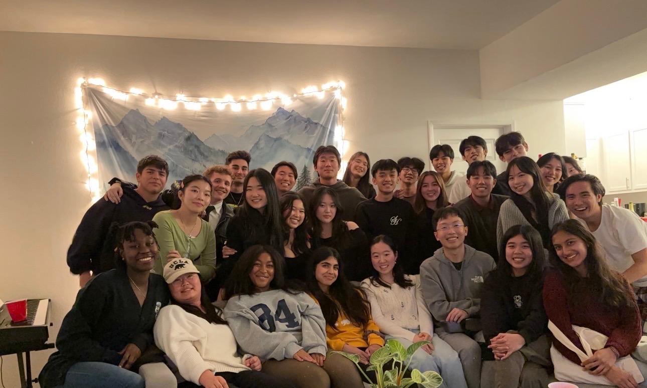
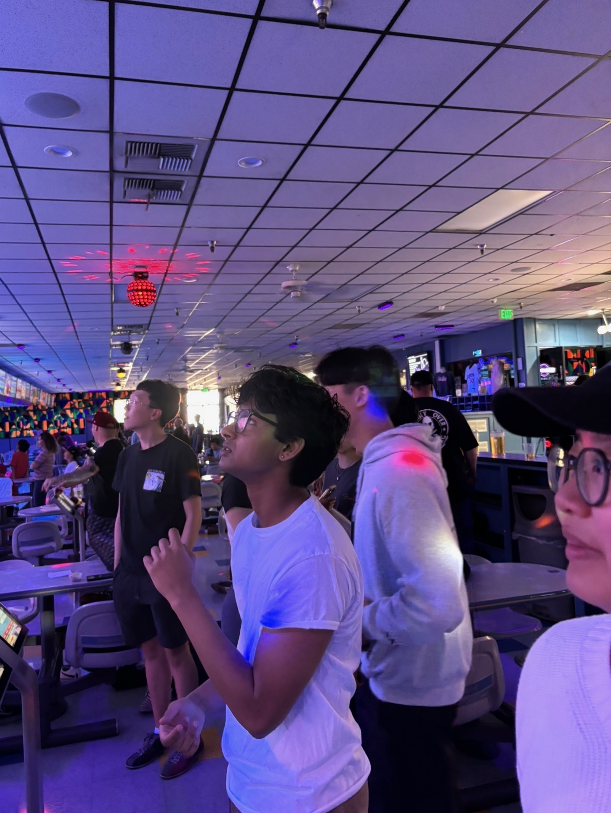
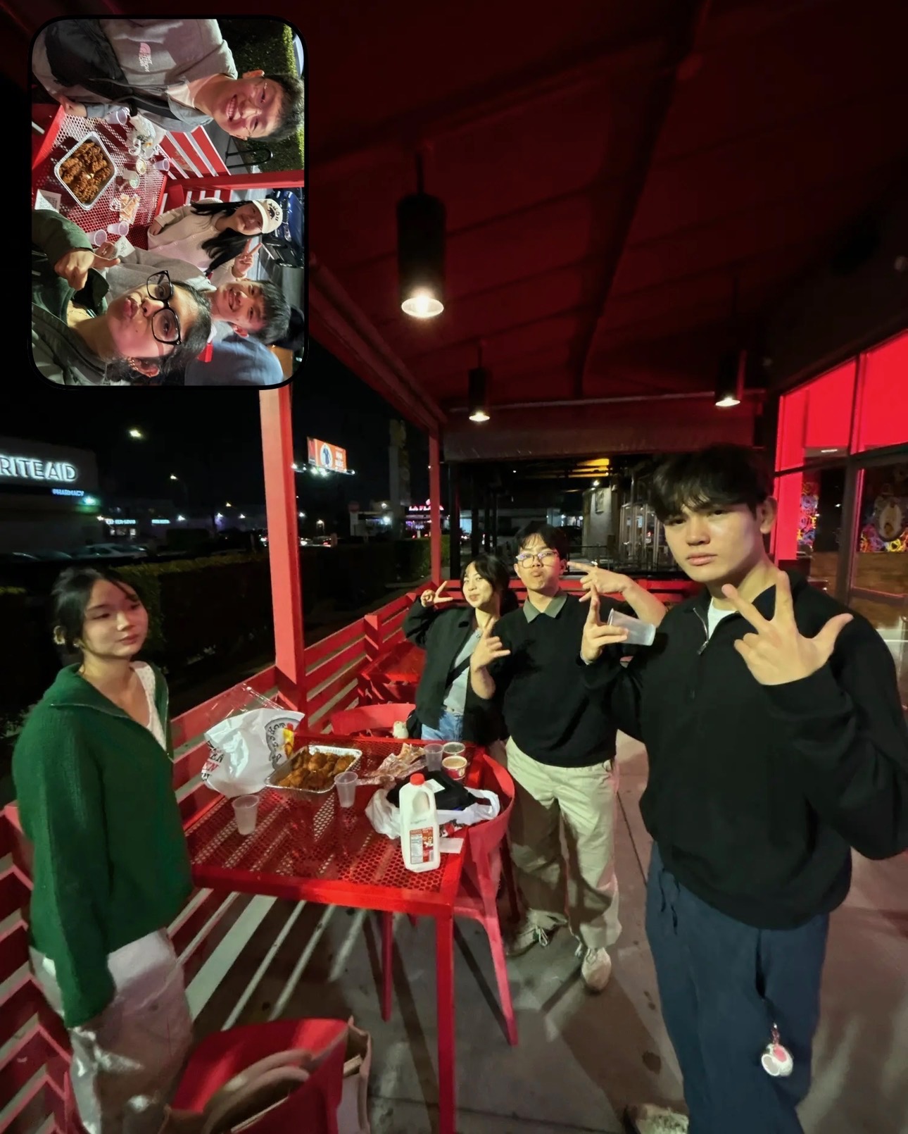
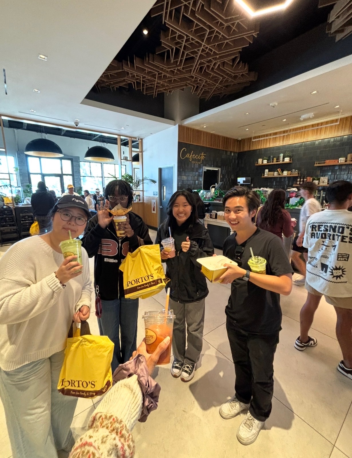
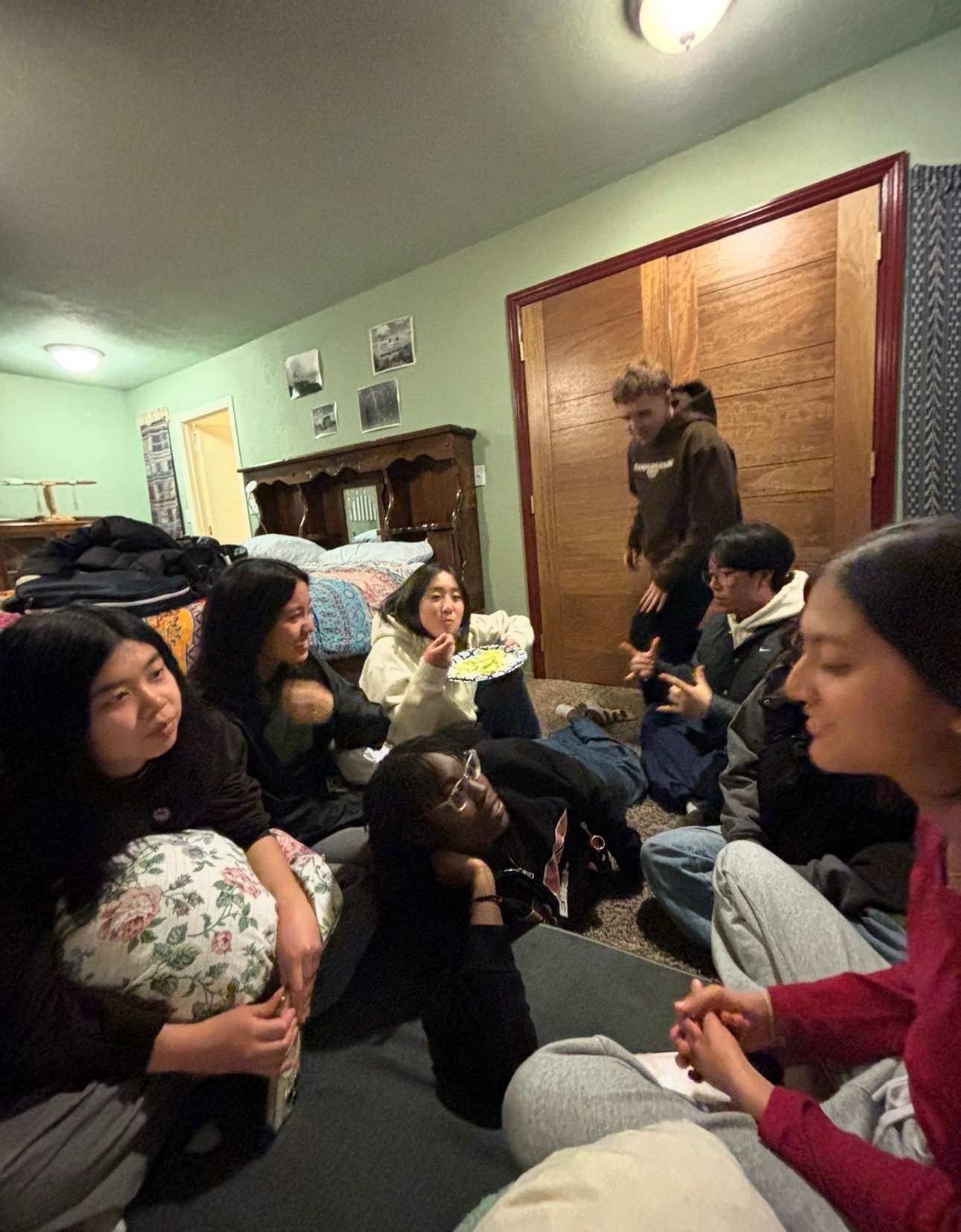
And in the middle of all of that, there were the moments that made everything feel worth it. Jmoon showing up with boba when we needed a break. The walks back after long nights. The random conversations that somehow made stressful days feel lighter. Those moments reminded me that this wasn’t just about getting the work done — it was about the people I was doing it with.
Somewhere along the way, this team became more than just teammates. They became my people.
They’re the ones who make me laugh when I’m stressed, who make long days feel shorter, and who turned this experience into something I’ll carry with me long after the project is over. UCLA, for me, would not be the same without them.
A few other projects that show how I design across community engagement, decision support, and product thinking.
Designed a softer journaling and reflection experience that helps students process emotions through guided prompts and visual rewards.
Built a product that helps users compare choices with weighted scoring, clearer reasoning, and a more confident final decision.
Learn more about who I am and what brought me into Product Management!